
Table of Contents
React, a popular JavaScript library for building user interfaces which has revolutionized web development since its release by Facebook. It offers a component-based architecture that allows developers to create reusable UI components, leading to faster development and more maintainable codebases. For businesses, leveraging React libraries can significantly enhance web application performance, user experience, and development efficiency. This blog explores what React libraries are, the criteria for selecting them, and lists the top 15 React libraries that modern businesses should consider.
What Are React Libraries?

React libraries are pre-built, reusable components and tools designed to work seamlessly with React applications. They provide functionalities that streamline various aspects of web development, such as state management, UI components, data visualization, and routing. By using these libraries, React JS developers can avoid reinventing the wheel, save time, and focus on building the unique features of their applications.
These libraries can range from simple utility libraries that add minor enhancements to full-fledged frameworks that provide comprehensive solutions to common development challenges. The right React libraries can drastically reduce development time, improve code quality, and ensure scalability for React JS developers.
Criteria for Selecting React Libraries
Choosing the right React libraries for a business involves several key criteria:
# Popularity and Community Support:
Libraries with a large user base and active community are often more reliable. They are regularly updated, have fewer bugs, and provide extensive documentation and support. A strong community can also offer assistance and plugins that expand the library’s capabilities.
# Compatibility:
Ensure the library is compatible with the current version of React and other libraries in use. Compatibility with existing systems and tools is crucial to prevent integration issues and reduce the learning curve for developers.
# Performance:
The library should enhance, not hinder, the performance of your application. Evaluate benchmarks and performance metrics. High-performance libraries contribute to faster load times and a better user experience.
# Documentation:
Comprehensive documentation is crucial for implementation and troubleshooting. Good documentation helps developers quickly understand and integrate the library, saving time and reducing frustration.
# Maintenance:
Active maintenance and regular updates are indicators of a healthy library. Libraries that are frequently updated are likely to keep up with the latest React features and security patches.
# Ease of Use:
The library should be intuitive and easy to integrate into existing projects. User-friendly libraries reduce the time required for developers to become productive and minimize the potential for errors.
# Features and Flexibility:
It should provide the necessary features and be flexible enough to adapt to various use cases. A flexible library can be tailored to specific project needs, making it more valuable in diverse scenarios.
Security: Ensure the library does not introduce vulnerabilities into your application. Reviewing the library’s security practices and community feedback can help assess its reliability.
Also read : Innovative React JS Web App Solutions for Turkish Businesses
List of Top 15 React Libraries with Website URL
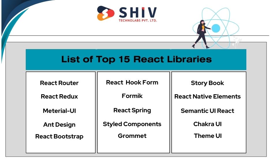
1) React Router
React Router is a standard library for routing in React. It enables the navigation among views of various components in a React application, allows changing the browser URL, and keeps the UI in sync with the URL.
React Router uses a declarative routing approach, enabling developers to define routes using JSX, which makes the code more readable and easier to manage. It supports nested routing, allowing for better control and organization of complex applications. The library also handles dynamic route matching and can work seamlessly with browser history for navigation. Its extensive API documentation and examples make it accessible for developers of all skill levels. Additionally, it integrates well with various state management libraries, providing flexibility and scalability.
2) React Redux
Redux is a predictable state container for JavaScript apps. It helps you write applications that behave consistently, run in different environments (client, server, and native), and are easy to test.
Redux offers centralized state management, making it easier to manage and debug the state of your application. Its strict unidirectional data flow ensures that the state is managed predictably, simplifying debugging and testing. Middleware support allows for the incorporation of asynchronous logic and side effects, enhancing the flexibility of state management. Redux DevTools provide state inspection and time-travel debugging, which are invaluable for development and troubleshooting. The extensive ecosystem of plugins and extensions allows developers to extend its functionality. Furthermore, it integrates seamlessly with React through React-Redux, providing a cohesive development experience.
3) Material-UI
Material-UI offers React components for faster and easier web development. It allows developers to build their own design system or start with Material Design.
Material-UI provides a comprehensive suite of UI components that adhere to Google’s Material Design guidelines, ensuring a consistent and visually appealing interface. The components are highly customizable, allowing developers to tailor the look and feel to match their branding. It supports responsive design out of the box, ensuring applications look great on all devices. Material-UI is built with accessibility in mind, making it easier to create applications that are usable by everyone. The library’s extensive documentation and active community support make it a reliable choice for any project.
4) Ant Design
Ant Design is a design system for enterprise-level products, aimed at creating an efficient and enjoyable work experience.
Ant Design provides a rich set of high-quality components that are designed to meet the needs of enterprise applications. Its components are customizable, allowing for the creation of a consistent and professional user interface. The library offers comprehensive design system guidelines, which help maintain design consistency across projects. Internationalization support ensures that applications can reach a global audience. Ant Design’s powerful form and table components are particularly well-suited for data-heavy applications. With active community and regular updates, it remains a cutting-edge choice for enterprise applications.
5) React Bootstrap
React Bootstrap is the most popular front-end framework rebuilt for React, providing Bootstrap components as pure React components.
React Bootstrap offers full compatibility with Bootstrap’s themes and styles, allowing for easy integration into existing projects. The components are designed to work seamlessly with React’s virtual DOM, ensuring optimal performance. The library focuses on accessibility, making it easier to create inclusive applications. Detailed documentation and examples help developers quickly get up to speed. React Bootstrap’s lightweight and modular approach allows developers to import only the components they need, reducing the overall bundle size.
6) React Hook Form
React Hook Form provides performant, flexible, and extensible forms with easy-to-use validation.
React Hook Form minimizes re-renders for improved performance, making it ideal for complex forms. It offers built-in form validation, reducing the need for additional libraries. The library is easy to integrate with various UI libraries, allowing developers to maintain a consistent design. It supports complex form layouts and dynamic forms, providing flexibility for different use cases. Detailed documentation and tutorials help developers get started quickly. React Hook Form is also compatible with validation libraries like Yup, further enhancing its capabilities.
7) Formik
Formik is designed to help build forms in React with ease, without the usual headaches associated with form management.
Formik simplifies form state management by providing a robust set of tools for handling form states and submissions. It supports schema-based validation with Yup, allowing for powerful and flexible form validation. Formik handles form submission and validation out of the box, reducing boilerplate code. It provides both a higher-order component and hooks API, giving developers flexibility in how they use it. Detailed documentation and community examples help developers get started and solve common problems. Formik is easily extendable with custom components and validations, making it adaptable to a wide range of applications.
Also read : The Role of React JS in UAE’s Digital Transformation
8) React Spring
React Spring is a spring-physics-based animation library that should cover most of your UI-related animation needs.
React Spring provides a declarative API for creating animations using hooks, making it easy to integrate into React applications. Its physics-based animations create realistic effects, enhancing the user experience. The library supports transitions, keyframes, and trail animations, offering a wide range of animation capabilities. Detailed documentation and examples help developers get started quickly and explore advanced features. React Spring integrates well with other React libraries, providing flexibility in how animations are used. It is lightweight and performant, ensuring that animations do not negatively impact application performance.
9) Styled Components
Styled Components allows developers to use the best bits of ES6 and CSS to style their apps without stress.
Styled Components provides scoped styling for components, ensuring that styles do not leak and affect other parts of the application. It allows for dynamic styling based on props and state, enabling responsive and adaptive designs. The library supports CSS-in-JS, which improves the developer experience by allowing styles to be written in JavaScript. Detailed documentation and examples help developers quickly get started and explore advanced features. Styled Components integrates well with other React libraries, providing flexibility in how styles are applied. It improves the maintainability of styles by co-locating them with components, reducing the need for separate CSS files.
10) Grommet
Grommet is a React-based framework that provides accessibility, modularity, responsiveness, and theming in a tidy package.
Grommet offers a rich set of accessible components that are designed to meet the needs of modern web applications. Its components are highly customizable, allowing for the creation of a consistent and professional user interface. The library supports built-in theming and styling, making it easy to maintain a cohesive design. Grommet is built with responsiveness in mind, ensuring that applications look great on all devices. Detailed documentation and examples help developers quickly get started and explore advanced features. The focus on usability and design consistency makes Grommet a great choice for building inclusive applications.
11) Storybook
Storybook is a tool for developing, documenting, and testing React components with ease.
Storybook provides an isolated environment for component development, allowing developers to focus on building and testing components without distractions. It supports various viewports and themes, making it easy to test components in different scenarios. The library includes built-in documentation and testing tools, ensuring that components are well-documented and reliable. Detailed documentation and examples help developers quickly get started and explore advanced features. Storybook integrates with popular testing frameworks, providing flexibility in how components are tested. It helps in maintaining a component library, ensuring that components are reusable and consistent across projects.
12) React Native Elements
React Native Elements is a cross-platform React Native UI toolkit that helps you build beautiful and performant interfaces.
React Native Elements provides a consistent set of customizable components that work seamlessly across different platforms. Its components are designed to be highly flexible, allowing for extensive customization to match the branding and design requirements of the application. The library supports built-in theming and styling, making it easy to maintain a cohesive look and feel. Detailed documentation and examples help developers quickly get started and explore advanced features. React Native Elements is easy to integrate with existing projects, allowing for seamless adoption. The focus on performance and user experience ensures that applications built with React Native Elements are both beautiful and efficient.
13) Semantic UI React
Semantic UI React is a popular UI component library for React applications that provides a collection of pre-styled components based on Semantic UI, a framework for building responsive, human-friendly HTML.
Semantic UI React offers a rich set of customizable UI components that help developers create visually appealing and consistent user interfaces. The components follow the principles of Semantic UI, using human-friendly HTML to describe elements. This approach makes the code more readable and easier to maintain. Semantic UI React supports a wide range of UI elements, including buttons, modals, and forms, each with built-in accessibility features to ensure inclusivity. The library also provides flexibility in styling, allowing developers to customize themes and override default styles to match their brand identity. Additionally, Semantic UI React integrates smoothly with existing projects, providing detailed documentation and examples to assist developers in quickly implementing its components. This combination of ease of use, customization options, and comprehensive component library makes Semantic UI React a valuable tool for building modern web applications.
14) Chakra UI
Chakra UI is a simple, modular, and accessible component library that gives developers the building blocks to create modern React applications with ease.
Chakra UI provides a comprehensive suite of customizable and reusable components that help developers build responsive and accessible web applications. Its components are designed with accessibility in mind, ensuring that applications are usable by everyone. Chakra UI offers a flexible theming system, allowing developers to easily customize the appearance of their components to match their design requirements. The library also supports dark mode out of the box, enhancing user experience in low-light environments. Chakra UI’s intuitive API and extensive documentation make it easy to integrate into existing projects and quickly get started. With its focus on simplicity and developer productivity, Chakra UI is a powerful tool for creating modern, user-friendly interfaces.
15) Theme UI
Theme UI is a library for creating themeable user interfaces based on constraint-based design principles. It is built on top of the popular Styled System library and works seamlessly with React.
Theme UI offers a robust system for creating consistent, themeable user interfaces in React applications. It allows developers to define design tokens and scales for colors, typography, spacing, and other design elements, which can then be applied consistently across components. This ensures a cohesive look and feel throughout the application. Theme UI supports a wide range of customization options, making it easy to adapt to different design requirements. It also includes a powerful CSS-in-JS solution, enabling dynamic styling based on component props and state. The library’s focus on accessibility ensures that all components are designed to be inclusive. With its detailed documentation and examples, Theme UI provides developers with the tools they need to build aesthetically pleasing and maintainable user interfaces efficiently.
Conclusion
Integrating the right React libraries can transform the efficiency and performance of web applications, giving businesses a significant advantage. Each of the libraries discussed offers unique features and functionalities that cater to various development needs. By carefully considering criteria such as popularity, compatibility, performance, documentation, maintenance, ease of use, features, flexibility, and security, businesses can choose the best tools to enhance their React applications. These libraries can save time, improve application performance, and contribute to a more efficient development process.
At Shiv Technolabs, we specialize in providing top-notch React JS development Company in USA. Our team of expert developers is dedicated to delivering high-quality, scalable, and maintainable web applications that meet the unique needs of your business. Whether you are looking to integrate powerful React libraries or build custom solutions from scratch, we have the skills and experience to help you succeed.
Choosing the right development partner is crucial for achieving your business goals, and Shiv Technolabs is committed to excellence in every project we undertake. With a focus on the latest technologies and best practices, we ensure that your applications are built to perform, with a user experience that delights your customers.
Contact Shiv Technolabs today to learn how we can help you harness the full potential of React JS development Company in USA. Let us assist you in creating innovative, high-performance web applications that drive your business forward.


