Table of Contents
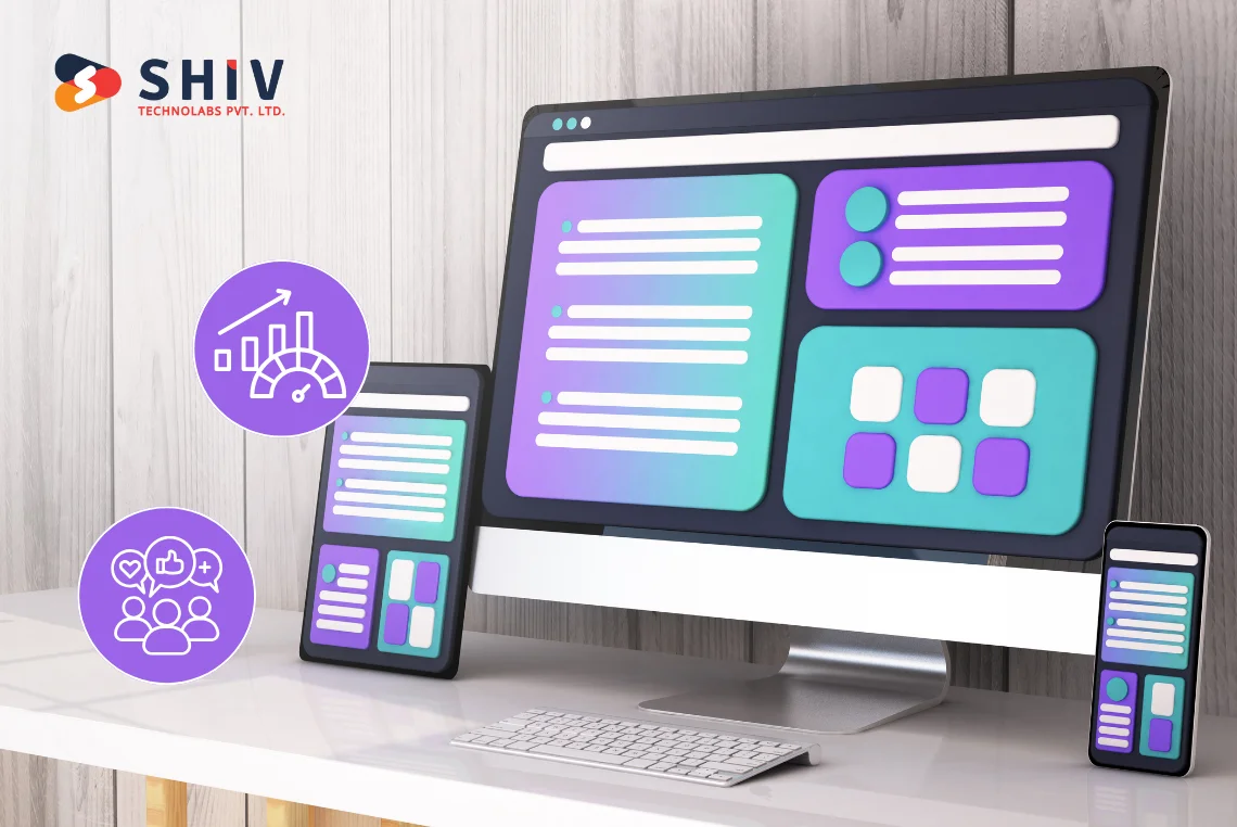
The users are no longer interested in using only one device to access the web. They are switching between phones, tablets, desktops and even smart TVs. If your web application isn’t built to adapt instantly and flawlessly across those screens, you’re not just losing clicks; you’re draining engagement, performance, and ultimately, revenue.
According to reports, more than 70% of users abandon the website due to unresponsiveness. Responsive web applications step in to address performance issues. They don’t just shrink to fit smaller screens. They are smart enough to fit any screen and direction, ensuring the user experience remains consistent regardless of how users access your app.
More devices. More user expectations. More reasons to go responsive. With our custom web application solutions, we ensure that our apps are scalable, responsive, and easy to engage with across all platforms.
What is a Responsive Web Application?
Responsive web applications are developed in such a way that they automatically adapt their layout, content, and functionality to the screen size, orientation, and type of device of the user. And it is not really about squeezing text and piling images, but it is about flexible, dynamic design, which offers consistency across smartphones, tablets, laptops, and desktops.
They are different from traditional web apps like this:
Traditional Web Apps
- Typically fixed-width
- Built with a desktop-first design
- Don’t adapt fluidly across devices
Responsive Web Apps
- Built using fluid grids and flexible layouts
- Prioritize mobile-first or mobile-equal design strategies
- Provide multi-device compatibility from day one
Example:
Consider Gmail in your browser. The interface remains consistent across devices, whether you’re using it on an iPhone, a Chromebook, or a 32-inch monitor, and it adapts slightly to any screen. That is a responsive web app at work.
Why Does Responsiveness Matter in Web App Performance?

When apps are slow to load or fail to function as expected, users tend to leave the app. Responsiveness directly impacts web application performance, including speed, layout stability, and interactive ability.
Quicker Browsing on Every Device
Optimized asset delivery is achievable with the help of responsive design. Responsive apps do not send large desktop images to mobile users; instead, they send smaller, device-specific images. This greatly cuts down start-up time.
Optimized Front-End Techniques
The top-performance responsive apps incorporate:
- Adaptive components that scale and resize without breaking
- Smart image scaling for different resolutions
- Minimal layout shifts to maintain visual stability
The methods directly contribute to the performance optimisation and make the interaction smoother.
Alignment With Google’s Core Web Vitals
Metrics like:
- Largest Contentful Paint (LCP)
- First Input Delay (FID)
- Cumulative Layout Shift (CLS)
When performing reliably, responsive web apps can meet these targets more effectively than their non-responsive counterparts.


How Responsive Web Apps Improve User Engagement
Your customers are anticipating a drag-free life. It wouldn’t matter how easy your app is to use if they can’t access it from any gadget at any time.
Better UX
Familiarity and trust are achieved through consistency across different screens. A user should not be required to “relearn” your app simply because it appears differently on their tablet compared to the desktop version. Responsive web design upholds branding, navigation, and operation on every interface.
Lower Bounce Rates
A quick, intuitive, mobile-friendly web application minimizes bounce rates and maximizes time spent on the site. The user (people) does not need to pinch or scroll awkwardly to navigate or find the controls they need.
Better Engagement Leads to Higher Retention
It is not all about the first impression when it comes to engagement. It is concerned with the retention periods of users and their return frequency. The responsive apps automatically ensure user retention by making the user experience smooth every time, on every device.
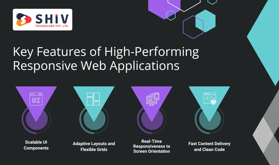
Key Features of High-Performing Responsive Web Applications
Designing a responsive app with high performance is not a matter of speculation. It involves applying the most tested design and development concepts, focusing on speed, flexibility, and user experience.
Scalable UI Components
Reusable components such as buttons, forms, and cards are made to adapt to the screen context, hence, your interface will remain natural regardless of whether it is a 5-inch or a 50-inch screen.
Adaptive Layouts and Flexible Grids
Instead of fixed pixel widths, responsive apps use:
- Fluid percentage-based layouts
- Media queries for breakpoints
- CSS Grid and Flexbox for responsive structure
This makes transitions smooth and maintains the harmony of the layout.
Real-Time Responsiveness to Screen Orientation
Users flip their phones. Tablets rotate. Responsive applications are those that automatically switch between portrait and landscape directions without disrupting the UI.
Fast Content Delivery and Clean Code
- Lazy loading assets
- Minified CSS/JS
- No render-blocking elements
Such practices have assisted in developing speedy web applications that are not only visually appealing but also exceptional performers.
SEO Benefits of Responsive Web Applications
Mobile-first indexing is becoming a priority for search engines. Your nonresponsive app translates to a direct hit on your visibility.
Eases Google Mobile-First Indexing
Google treats responsive web applications as mobile-first. That implies they prioritize their mobile version as the ranking source. Any application that is not responsive is at risk of suffering low SEO.
Better Crawlability and Link Equity
Using a single URL structure with a responsive design helps:
- Preserve link equity
- Simplify site structure
- Avoid crawl budget issues
Web applications are more likely to rank in specific niches because search bots can traverse responsive web apps more effectively.
No Copy and Paste
Responsive design does not require dedicated m-dot versions. This helps eliminate risks of duplicate content and improves the user experience and SEO hygiene.
Also Read: Web Application Development Cost
Business Advantages of Investing in Responsive Web App Development
Responsiveness goes beyond simply being a technical advantage, which has an immediate bottom-line effect on you. Here are some impressive business benefits of responsive web app development:
Greater Cross-device Conversions
Responsive web app development solutions make the conversion funnel easier. Whether booking a demo, adding to cart, or signing up, customers enjoy an efficient experience across all devices, and even conversion rates rise.
Improved ROI Over Time
It is more economical to invest in a scalable, device-responsive web application than to maintain multiple versions for specific devices. The level of maintenance decreases, and the satisfaction level increases.
Increased Advantage Over Competition
The distinction between a decent and fantastic UX may dictate who becomes a market leader. Responsive interface design demonstrates that you are concerned with quality and accessibility, and you do not forget it.
Building Responsive Web Applications the Right Way
The idea of responsiveness should involve recent tools and intelligent scheduling, as well as a good team that possesses knowledge of how performance should appear, ranging from the architecture of the software to the front-end design.
Selection of the Appropriate Frameworks
Tools like React, Next.js, and Vue are built for dynamic, component-driven development. They support:
- Server-side rendering
- Real-time responsiveness
- Modular user interface systems
- Best suited to performance-responsive UI.
Convergence of Front-End and Back-End
A performance web app is closely integrated between the UI/UX design, front-end code, and the backend architecture. Sloppy integrations or anything that drags the APIs kills responsiveness.
Why Expertise Matters
You require a host of other things beyond developers. You are required to have a plan, the responsive interface design, database optimization, etc.
With our custom web application services, responsiveness is factored in at every stage, from wireframes to final testing. All components are checked across devices so that they are fast, consistent, and accessible.
Conclusion
Responsiveness is not a feature but a demand for any web application nowadays. It drives higher performance, enhanced user engagement, and future growth.
If your existing application doesn’t scale properly across various devices, you risk losing users before they even reach your core functionalities. It is time to assess your web presence in terms of not only how it appeals, but also how well it responds, performs and engages.
That’s where Shiv Technolabs, a web app development company, steps in. We have a team of development experts who excel at developing mobile-friendly web applications that deliver impressive user experiences. Our team builds digital experiences that are fluid, fast, and future-proof.
At Shiv Technolabs, our team of developers boasts over a decade of experience in developing applications that seamlessly work across any screen, keeping users engaged.
Thinking of giving wings to custom web application solutions? Connect with Shiv Technolabs today, and let’s talk responsive.


