
Table of Contents
When building web applications, speed and consistency are essential. Managing dozens of UI elements across multiple screens without a structured system quickly turns chaotic. To avoid this, we rely on a shared components library built specifically for Next JS.
This method allows our development teams to reuse design patterns, reduce repetitive code, and maintain quality at scale. Whether a project involves one developer or ten, a component-driven approach keeps the codebase unified and manageable.
This article outlines how we build and use a Next JS components library to improve project delivery and interface consistency.


What Is a Components Library?
A components library is a set of reusable UI elements—buttons, forms, layouts, modals, inputs, and more—written to be portable and adaptable across projects. These elements are created once and then reused wherever needed in the application.
This approach reduces time spent rebuilding common elements and helps developers focus on business logic instead of markup and styling. Each component is purpose-built with a clear structure, allowing it to be used in multiple contexts without breaking visual or functional rules.
Why We Build Web Apps with Next JS?

Next JS is a React framework built for performance, flexibility, and simplicity. It includes features like:
- Server-side rendering and static site generation
- File-based routing
- API support out of the box
- Automatic code splitting
- Fast refresh for real-time feedback during development
When combined with a components library, Next JS becomes even more productive. Developers can quickly scaffold apps, reuse logic, and deliver consistent UI patterns without compromising performance or structure.
Benefits of a Next JS Components Library
A well-structured components library offers more than just design consistency—it simplifies development and improves collaboration across teams.
When paired with Next JS, especially as part of professional Next JS development services, it becomes a powerful foundation for building scalable, maintainable web applications with less overhead and faster turnaround.
# Faster Start to Every Project
Instead of starting from scratch, we begin with a fully equipped design system. From buttons to layout containers, everything is already styled and documented. This means we spend less time rebuilding common UI and more time solving actual product needs.
# Visual and Structural Consistency
A shared components library reduces inconsistencies in layout, spacing, and typography. When every page pulls from the same source, the final application looks polished and stays aligned with design guidelines.
# Less Repetition, Less Room for Bugs
When a button or modal works perfectly once, there’s no reason to rebuild it. Reusing tested components means fewer bugs, less QA overhead, and shorter feedback loops.
# Easier Maintenance Over Time
When updates are needed—such as design changes or accessibility improvements—we make the change in the source component, and the update applies everywhere it’s used. This avoids code duplication and reduces the risk of missed updates.
Typical Structure of Our Next JS Component Libraries
We organize our component library by type and function, making it easy to find, reuse, and maintain each element. A typical folder structure might include:
- ui/ — for basic components like Button, Input, Badge
- layout/ — for Header, Footer, Sidebar
- form/ — for grouped elements like FormField, CheckboxGroup
- hooks/ — for utility logic such as useToggle, useDropdown
- styles/ — for shared classes, tokens, and themes
Each component is isolated, tested, and written in TypeScript to catch errors early and support autocomplete in IDEs.
Storybook for Visual Component Testing
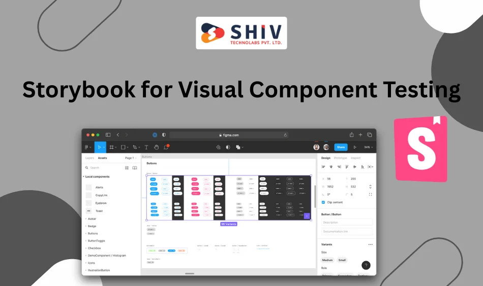
To document and preview our components, we use Storybook. It allows developers, designers, and QA teams to interact with each component in isolation without spinning up the full application.
Storybook also makes it easier to:
- Test components in different states (loading, success, error)
- Share components with stakeholders during design reviews
- Maintain a live component catalog throughout the project lifecycle
This tool plays a key role in quality control and helps everyone stay aligned.
Essential Tools for Building with Next JS Components
Alongside Next JS, we use a set of tools that support a component-driven development process:
- TypeScript – for safer, more maintainable code
- Tailwind CSS – for consistent styling with utility classes
- ESLint & Prettier – for clean and standardized formatting
- React Testing Library – for testing interactive elements
- Git version control – for change tracking and collaboration
These tools keep our components predictable, testable, and well-documented.
When to Use a Reusable Components Library
Reusable component libraries make the biggest difference in:
- Multi-developer projects
- Applications with repeatable design elements
- Products that scale over time
- Platforms that require frequent UI updates
- Apps with strict design or accessibility guidelines
If you’re building a site or platform that fits these categories, this approach will save time, reduce errors, and simplify long-term maintenance.
Build Scalable Web Apps with Next JS and Shiv Technolabs
If you’re planning a modern web application and want faster delivery without compromising code quality, Shiv Technolabs is ready to support your goals. We build scalable frontend systems using a component-first approach powered by Next JS.
Here’s what you get when you work with us:
- A custom Next JS components library tailored to your project
- Faster development cycles with reusable UI patterns
- Clean, maintainable code that scales with your business
- Consistent design implementation across every screen
- A team that understands both structure and speed
From MVPs to enterprise builds, our approach helps teams move quickly without losing control of the codebase.
Ready to bring structure and speed to your next web project?
👉 Contact Shiv Technolabs today and let’s build it right.
Final Thoughts
A Next JS components library isn’t just a technical preference. It’s a system for working smarter, building faster, and keeping apps stable over time. When structured well, it becomes a core asset across projects, not just a nice-to-have.
We continue to build and refine our library based on real project needs, ensuring that each component we create adds value to the process.
By prioritizing consistency, reusability, and clarity, we’re able to deliver better applications with less complexity, no matter the scale of the project.


