Table of Contents
Users judge a website in just 0.05 seconds. That is how quickly your frontend design should be ready. In 2026, the global eCommerce market is projected to climb to an $8.1 trillion market, and the look and feel of your site impacts your success.
Frontend development does not only mean how a site looks. It plays a key role in user behavior in UI on your platform. Each visual and interactive detail can either guide users further or deter them.
This article breaks down how frontend design shapes user actions and helps improve conversions especially valuable if you’re working with a front end development company or planning to hire one.
What Is Frontend Development and Why Does It Impact User Behavior
Front-end development encompasses everything that can be seen and used by users on a site or application. It addresses the design, color selection, menus, animations, forms, and the way all of these elements function across varying screen sizes. It is written in HTML, CSS, and JavaScript. However, the frontend is not just code; it is about the complete user experience.
Why frontend matters for user behavior:
- First Impressions Count: Visitors form a quick judgment on whether they can trust the site. Poor graphics or faulty layouts can have a profoundly negative impact.
- Navigation Affects Flow: Simple-to-navigate menus keep people engaged. Confusing ones make them leave quickly.
- Responsiveness Drives Retention: Almost 54% of traffic is captured from mobile, so, making the UI responsive is important.
- Micro-interactions Boost Engagement: Even small interactions, such as hover effects and seamless transitions, influence the experience positively.
If you ignore how your frontend affects user decisions, you ignore a big part of the sales process.
How Frontend UI Design Shapes User Decisions and Actions

A good-looking frontend doesn’t just attract users. It subtly prompts them to take actions such as clicking, signing up, or making a purchase. These frontend choices influence what people do on your site.
Visual Hierarchy Directs Attention Instantly
When titles, images, and buttons are placed correctly, users know where to look. Bigger fonts, strong contrast, and enough spacing guide their attention.
Color Psychology Influences Emotions
Colors change how people feel. Blue builds trust, red conveys urgency, and green signifies success. Good frontend design uses colors on purpose, not just for style.
Clear Spacing and Layout Improves Focus
Too much content in one place makes it hard to focus. Clear white space helps users scan content and avoids confusion.
Trust Signals Build Confidence
Items like badges, SSL icons, reviews, and known brand logos make people feel secure. Users are more likely to make a purchase when they trust your site.
Design That Matches Natural Scanning Patterns
Most users don’t read every word. They scan in patterns like F or Z. Your design should follow these patterns and guide users to key points.
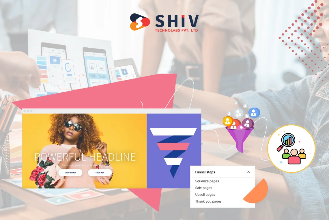
How Frontend Affect Each Stage of the Digital Sales Funnel?
The digital sales funnel illustrates the steps users take before making a purchase. Frontend design has an effect at each stage. Here’s how it helps move users from awareness to purchase.
Awareness: First Impressions and Page Speed
- Responsive designs mean that your site is functional on any screen size.
- Quick page-load count. Delays of 1 second have the power to reduce conversion rates to 7%.
- Users remember your site using consistent visuals and branding.
- An uncluttered and clean layout on the header will prevent users from jumping away of users too early
Consideration: Guiding Users with Intuitive Navigation
- Menus should be simple. Filters and breadcrumbs help users explore easily.
- Charts, reviews, and visuals help users compare and decide.
- Helpful sections like FAQs or guides make users feel confident.
Decision: Conversion-Focused Design and Trust Builders
- There should be calls-to-action (CTAs) that would be noticeable and appear like the most logical next step.
- Make the forms short and simple. Align fields neatly and ensure they work well on mobile.
- Small animations on buttons or form fields make the process smoother.
- Trust icons, secure checkout messages, and clear return policies ease last-minute doubts.


Psychological Triggers in Frontend Design That Drive Action
Good frontend developers use psychology to influence behavior. These design elements can push users to act.
Color Psychology and Emotion
- Red = urgency
- Green = success
- Blue = calm and trust
Use these colors where actions are needed.
Button Size and Placement
Buttons should be big enough for mobile users. They must stand out and be easy to spot. Place them both at the top and bottom of the page.
Whitespace as a Tool
Blank space is useful. It helps separate content, keeps designs clean, and lowers user stress.
Scroll Depth and Engagement Cues
Elements like arrows or sticky menus show users where to go next. These tools keep users moving.
Sticky CTAs and Micro Animations
Sticky buttons like “Buy Now” or “Contact Us” help users act anytime. Animations draw attention without being annoying.
Also read: Top 12 Front-End Frameworks to Supercharge Your Web Development
Common Frontend Mistakes That Harm Funnel Performance

Each part of your frontend should help users move forward. Mistakes in design often cause users to leave before taking action.
Slow-Loading Pages
- Heavy codes, big pictures and un-compressed files decrease the speed of your site.
- Use pagespeed tools such as Google PageSpeed or Lighthouse to check your site speed.
Overcomplicated Navigation
- When there are numerous menu options, users are confused.
- When there are excessive options available, decision fatigue occurs.
Inconsistent Design Elements
- Using different fonts, button styles, or colors breaks trust.
- Inconsistent design looks unprofessional.
Non-Responsive UI
- Sites made only for desktops ignore mobile users.
- Forms, sliders, and buttons must adjust to any screen size.
Bad UI Examples That Kill UX
- Popups without close buttons
- Hidden CTAs
- Links that reload the same page without moving forward
Examples of High-Converting Frontend Experiences
Let’s explore how top brands utilize frontend strategy for business to boost conversions.
Amazon
- Focuses on a clean checkout process
- Offers one-click purchases
- Displays products clearly with visible CTAs
Shopify Storefronts
- Uses strong visual order in themes
- Shows trust signs and reviews
- Designs layouts for mobile-first use
- Includes upselling and cross-selling tools
SaaS Landing Pages
- Delivers direct messaging
- Place free trial buttons near the top
- Uses animations to show how products work
These sites don’t succeed by chance. They test and improve their frontend to get better results.
How Frontend Development Services Improve Funnel Results
Improving your frontend takes regular testing and skilled changes. That’s where frontend development services help.
UI/UX Audits
Experts review your current design and identify areas where users tend to drop off.
Design Updates
Even minor updates, such as fonts, improved spacing, or enhanced CTAs, can do the trick.
Responsive and Speed Optimization
They plan a frontend strategy for business to ensure that your site loads quickly and is able to work on all devices.
Funnel-Specific Layout Tweaks
They reshape landing pages, product pages, and checkout and direct users ahead.
A/B Testing and Continuous Improvement
They experiment to determine which version is most effective and update accordingly.
Shiv Technolabs focuses on frontend designs that help your business grow.
Why Founders Should Treat UI as a Sales Tool?
Your UI is more than just visual appeal. It shapes how people act. It deserves attention just like any other sales tool.
Your Frontend Is Your Salesperson
It welcomes visitors, explains your product, and closes the deal. A good frontend does the job of a full sales team.
Invest in Frontend, Reap Real Returns
Spending on frontend upgrades gives you better engagement and higher conversions. The return on investment is strong.
Build a Long-Term UI Strategy
Don’t focus only on fonts or colors. A full UI plan changes as users and tech change. It helps you stay ahead.
Contact Shiv Technolabs: Your Frontend Growth Partner
Shiv Technolabs creates frontend experiences that guide users toward action. Everything, including clear layouts and intelligent CTAs, is focused on growth.
We can assist you with the complete redesign or even with the minor adjustments. Our frontend services aim to increase your results.
Contact us today for a free consultation for sales funnel optimization.
Conclusion
Frontend design does more than make your site look nice. It shapes user behaviour and influences the conversion rate of many people. Every scroll, click, and form matters.
For genuine growth, update your frontend. Shiv Technolabs offers tools, skills, and plans to turn your website into a strong digital sales funnel.
Visit Shiv Technolabs to get started. Let’s transform your frontend user experience to deliver performance and tangible results.