Table of Contents
When you look into healthcare, data is everywhere — patient records, insurance claims, lab results, equipment maintenance logs, appointment data, and more. With this massive flow of information, healthcare organizations face challenges in visualizing, analyzing, and acting on the data in a timely and efficient manner.
This is where Power BI comes in. By building a Power BI healthcare dashboard, medical facilities can transform raw data into actionable insights that improve patient outcomes, reduce costs, and enhance decision-making.
This guide walks you through the process of creating a healthcare dashboard in Power BI, from initial planning to deployment.
Whether you’re a hospital administrator, health IT manager, or data analyst, this blog will help you understand how to turn data into decisions using the right tools and methods.
Let’s dive in.

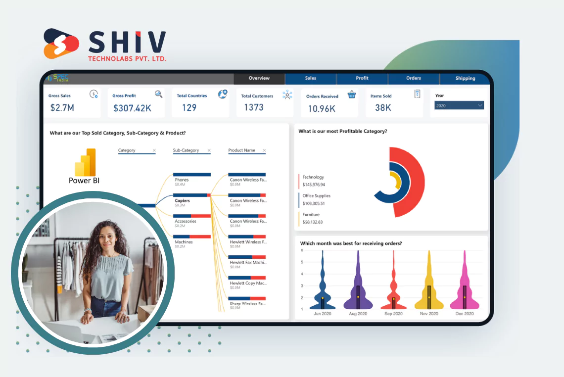
What is a Power BI healthcare Dashboard?
A Power BI healthcare dashboard is an interactive, visual interface designed to present healthcare data in an organized and meaningful way.
These dashboards allow decision-makers to monitor key performance indicators (KPIs), track clinical outcomes, manage hospital operations, and spot patterns or anomalies in real-time.
Organizations often pair these dashboards with custom healthcare development services to ensure the solution aligns with their unique workflows, data sources, and compliance needs.
A well-structured healthcare Power BI dashboard can include data on:
- Patient demographics and history
- Admission and discharge trends
- Emergency room (ER) wait times
- Bed occupancy rates
- Staff workload distribution
- Medical inventory levels
- Diagnostic lab metrics
- Financial performance
With Power BI’s capabilities, healthcare providers can consolidate this data from various sources and visualize it in a single dashboard for quicker insights and better resource management.
Benefits of Using Power BI in Healthcare

Before diving into the development process, it’s important to understand why Power BI is a preferred tool for building healthcare dashboards.
- Real-Time Analytics: Power BI enables up-to-date insights into hospital performance, allowing quick decisions during critical situations.
- Integration with Multiple Data Sources: Power BI connects with EMRs, SQL databases, Excel files, APIs, and more.
- Interactive Visualizations: Users can slice and dice data interactively, drilling down into specifics such as by department, location, or physician.
- Cloud and On-Premise Compatibility: Power BI dashboards can be accessed via web, mobile, or within secure, on-prem environments.
Now that we’ve covered the value proposition, let’s move to the step-by-step guide.
Step 1: Pick the Use Case You Actually Need
Don’t try to track everything in one dashboard. Start by narrowing down your focus to a real problem you need to solve. A few focused examples:
- Reducing ER wait times
- Monitoring ICU bed availability
- Tracking patient discharge delays
- Spotting billing bottlenecks
- Monitoring lab turnaround times
📌 Example: Let’s say your goal is to reduce emergency room congestion. Your Power BI dashboard should track wait times, bed availability, triage levels, and average time from admission to discharge.
Why this matters: Clarity in your goal drives every decision afterward — from what data to connect, to which KPIs to prioritize.


Step 2: Map Out the Data Sources You Have (and Trust)
Healthcare data is messy. You’re likely pulling from a mix of EHR systems, Excel files, internal databases, maybe even manual logs.
Typical sources include:
- EMR/EHR systems (like Epic, Cerner)
- SQL Server or Oracle DBs for hospital systems
- Excel sheets used by department heads
- Lab information systems (LIS)
- Third-party APIs for insurance or billing
- CSV exports from inventory or HR tools
🔧 Your task: List out where the data lives, who owns it, and how clean it is. Then prioritize sources that are:
- Reliable (no manual tweaking every week)
- Frequently updated (real-time is best)
- Accessible (you can actually connect Power BI to it)
🎯 Tip: If your current system doesn’t expose real-time data, build scheduled refresh logic into Power BI with proper credentials.
Step 3: Translate Hospital Metrics into Power BI-Ready KPIs

You can’t visualize what you can’t measure. So next, convert your hospital or clinic’s performance metrics into Power BI logic.
Examples for an ER Performance Dashboard:
- Average ER wait time = AVG(DischargeTime – CheckInTime)
- Bed utilization = OccupiedBeds / TotalBeds
- Patients per hour = COUNT(Patients) grouped by hour
- Re-admission within 30 days = COUNT(Patients re-admitted in 30 days)
This step involves building:
- Calculated columns (for static logic like age, duration)
- Measures (for dynamic metrics using DAX)
- Relationships (to link tables like Patients, Visits, Staff)
🎯 Tip: Don’t just import data — model it. Your healthcare Power BI dashboard will only be as good as your underlying relationships and DAX logic.
Also Read: ERP Systems in Healthcare
Step 4: Design the Flow Like a Doctor Uses It
A healthcare dashboard isn’t a report — it’s a live command center. So, design the layout to match how a doctor, admin, or operations manager thinks.
Structure your layout with this logic:
- Top-level: KPIs that demand immediate action (e.g., “Avg ER Wait Time > 2 hours”)
- Mid-level: Trends over time to support decisions (“ER visits per hour”)
- Drill-down: Filters for date ranges, departments, and patient categories
Avoid “design for design’s sake.” Instead:
- Use card visuals for snapshot metrics (wait time, bed count)
- Use slicers for time, location, and department
- Use heat maps for identifying overloaded departments
- Limit color to red/yellow/green, where performance thresholds are clear
🎯 Tip: If the end user can’t glance at the dashboard and make a call in 10 seconds, the layout needs a rethink.
Step 5: Build a Custom Data Refresh Strategy
Hospitals can’t work with stale data. And not all data needs to update every 5 minutes — some of it just needs to be reliable and on schedule.
Here’s how to plan refresh logic:
- ER/ICU dashboards: Real-time or every 15 mins
- Financial dashboards: Nightly
- Operational (beds, labs): Hourly
- Patient satisfaction surveys: Weekly
Use Power BI Gateway or APIs to manage live data sources. Set up alerts for failed refreshes — healthcare can’t afford blind spots due to outdated info.
🎯 Tip: We often create custom refresh workflows using Power Automate + Power BI for healthcare clients needing stricter timing and control.
Step 6: Implement Role-Based Access (Not Everyone Should See Everything)
Healthcare data is sensitive. You don’t want lab staff viewing billing info or admin teams accessing patient diagnostics.
Power BI supports:
- Row-Level Security (RLS): Filters data based on the user’s identity.
- App workspaces with viewer/editor roles
- Shared datasets with scoped permissions
Example:
- Doctors see only their patient visits and department metrics
- Department heads see all metrics within their unit
- Executives see full hospital-wide views
Build roles early — not as an afterthought — to avoid backtracking and rebuilds later.
Step 7: Test With End Users Like It’s a Real Shift
Once your Power BI healthcare dashboard is built, don’t launch it yet. Test it in a real-world setting.
Ask stakeholders to:
- Use it during actual shift handovers
- Make a decision based on its data
- Find a flaw, lag, or missing metric
Then fix what you missed:
- Filters that don’t reset properly
- KPIs not aligned with department-specific goals
- Users are overwhelmed by too many visuals
- Mobile version not optimized (Power BI mobile is powerful, but underused)
📋 Final check: If a doctor or nurse can’t use it in 30 seconds during peak hours, simplify it.
Step 8: Track Usage, Improve, Repeat
Your job doesn’t end after publishing the dashboard.
Power BI gives usage metrics. Use them.
- Which visuals are people clicking?
- Are they using the filters?
- Who isn’t logging in?
Based on that, streamline and evolve your dashboards. Maybe remove deadweight metrics. Maybe create department-specific views.
What a Great Power BI Healthcare Dashboard Looks Like (Examples)
Here are a few example dashboards that solve real-world healthcare challenges:
- Bed Management Dashboard: Tracks real-time occupancy, bed turnover, and pending discharges. Helps nursing and facility teams coordinate faster patient placement.
- ER Throughput Dashboard: Displays wait time, number of arrivals, triage levels, and discharge delays. Used by operations to optimize staff allocation.
- Lab Workflow Dashboard: Monitors sample collection, result entry time, and test types. Helps improve lab turnaround and flag delays.
- Billing & Revenue Cycle Dashboard: Tracks claims submission, denials, and pending payments. Useful for the finance team to reduce revenue leakage.
Each of these dashboards uses real healthcare logic, not generic KPIs — and that’s the key.
Real-Life Power BI Healthcare Dashboard Examples
To help you visualize what’s possible, here are some practical Power BI healthcare dashboard examples:
- HealthStat – Built a Power BI dashboard to analyze hospital efficiency and patient length of stay, using advanced DAX for actionable insights.
- Kanerika + Global MedTech Firm – Integrated Power BI across departments, improving decision-making by 25% and cutting response times by 40%.
- Datalize (UK healthcare Provider) – Transformed manual reporting into real-time dashboards, improving data access and operational decisions.
- Ukraine Clinic Chain – Used Power BI to automate daily reporting, improving budget forecasts and management control across multiple locations.
These examples demonstrate the practical application of Power BI in healthcare settings, showcasing how data visualization and analysis can lead to improved operational efficiency and patient care.
Common Mistakes to Avoid
Here are a few pitfalls to watch out for when developing a healthcare dashboard in Power BI:
- Overloading the dashboard with too many visuals
- Using inconsistent data formats or units
- Ignoring data refresh and validation schedules
- Not testing the dashboard with real end-users
- Failing to apply security or role-based access
To avoid these issues, it’s often helpful to hire Power BI developers who understand both the technical and domain-specific needs of healthcare analytics.
Avoiding these mistakes ensures that your Power BI dashboard for healthcare remains reliable and actionable.
Must Read: Power BI Limitations that Could Impact Your Business
Why Choose Shiv Technolabs for Power BI Healthcare Dashboards?
At Shiv Technolabs, we understand the critical importance of data in the healthcare sector. Our team offers end-to-end expertise in building insightful, user-friendly, and secure dashboards using Power BI.
Whether you’re looking for a proof of concept or a fully integrated reporting suite, we provide:
- Data modeling and integration from EHRs, databases, and APIs
- Custom visualization tailored to your healthcare use case
- Real-time dashboard deployment with advanced interactivity
- HIPAA-compliant implementation for secure data handling
As a trusted partner in power BI consulting as well as healthcare analytics, Shiv Technolabs helps organizations like yours make smarter decisions, faster.
Final Thoughts
A Power BI healthcare dashboard can dramatically improve how healthcare providers operate, make decisions, and care for patients. With the ability to consolidate, analyze, and present data in real time, these dashboards become essential tools for efficiency and transparency.
By following the steps outlined in this guide—from setting goals and preparing data to building visuals and sharing securely—you’re well on your way to building a healthcare dashboard in Power BI that truly makes a difference.
And if you’re ready to turn your data into a powerful asset, reach out to Shiv Technolabs today. Together, we can bring clarity to your healthcare operations through smart data solutions.